Victoria company helps developers create user-friendly software

Victoria company helps developers create user-friendly software
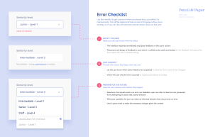
Pencil & Paper has created a design course to help developers make user-oriented design decisions.
Victoria’s tech sector boasts a pipeline of talented developers whose intricate algorithms reach individuals around the globe, in digital interactions of every shape and form. It’s in the subtle details of those interactions that good programming comes to life, determining how the user experiences the software.
In response to a huge demand for training for software developers, the user experience (UX) studio Pencil & Paper has created a design course to help developers make user-oriented design decisions. Design SOS is a short course that teaches developers fundamental UX concepts and strategies they can apply to any project they face — from website development to phone apps to heavy-duty software applications.
“It’s a really practical kind of applied UX design course that helps developers translate what they have in their head into reality,” says Ceara Crawshaw, CEO of Pencil & Paper and founder of Design SOS.
When a software designer is building any kind of digital experience, whether it’s a website or product, there are thousands of little micro-decisions to be made as they build the code for it. Without a designer’s input at that granular level, many developers end up making minor design decisions on the fly.
An example of this is the moment you sign up for a financial product. When the app asks you to connect to your bank, does it just give you the default choice to connect or does it reflect the questions you might have: What’s being connected? Can I disconnect? What are the security protocols? How exactly does it work? A UX designer would reflect on those questions and design a user journey that might answer those questions before offering to make the connection.


The need for User Experience
Crawshaw noticed that a lot of developers felt like they kept “putting lipstick on a pig.” The incremental changes and adjustments they were making didn’t affect the kind of change or scale of improvement that they wanted to see. That was the first prompt for Crawshaw to design the course, seeing the desire for those skills.
The second prompt was that Crawshaw found she was already doing the teaching. As a UX designer, she and her team would often be educating their developers as they worked through the designs issued for a project.
Crawshaw noticed a gap in the market. Other UX courses were longer, a more immersive Bootcamp, and geared towards certification. There was a need for an easily accessible, not-too-long, skills-based course that people could fit in around their work. Sounds like a micro-credential? It’s 2-3 hours total of video-based learning.
Designing the Course
How does a UX designer go about designing a course? They avoid hypocrisy by testing with a group of users first. In this case, Crawshaw brought together a beta testing group of 22 developers from GitLab, Stocksy, Billi, Mazumago, Workday and Garmin who worked through the content and provided feedback on the course. It’s one of the first design courses to be validated by developers themselves.
“The kinds of benefits that we saw developers get through the beta groups that they really understood more clearly how you think as a designer,” says Crawshaw. “That helped them apply these sorts of things all the time. We set the baseline of expectations within the course, such as: How you can make a good experience? What’s that made out of?”
Along with the video content, students are given exercises that lead them through the process of making decisions with user experience in mind. The course provides a few tools that can be used to create experiences that are more focused on the user. For example, ‘visual hierarchy’ is explained in this YouTube video tutorial.
What’s next? There are 12 more course topics “on the roadmap,” says Crawshaw.
“We want to create a platform, that’s basically the place that you would go to find all of this information that we don’t have out there. Really tactical resources and examples. We want build the internet for enterprise user experience.”
Images

Additional Info
Source : https://www.douglasmagazine.com/charting-the-course-victoria-company-helps-developers-create-user-friendly-software/